Visual Design That Creates Interest and Trust
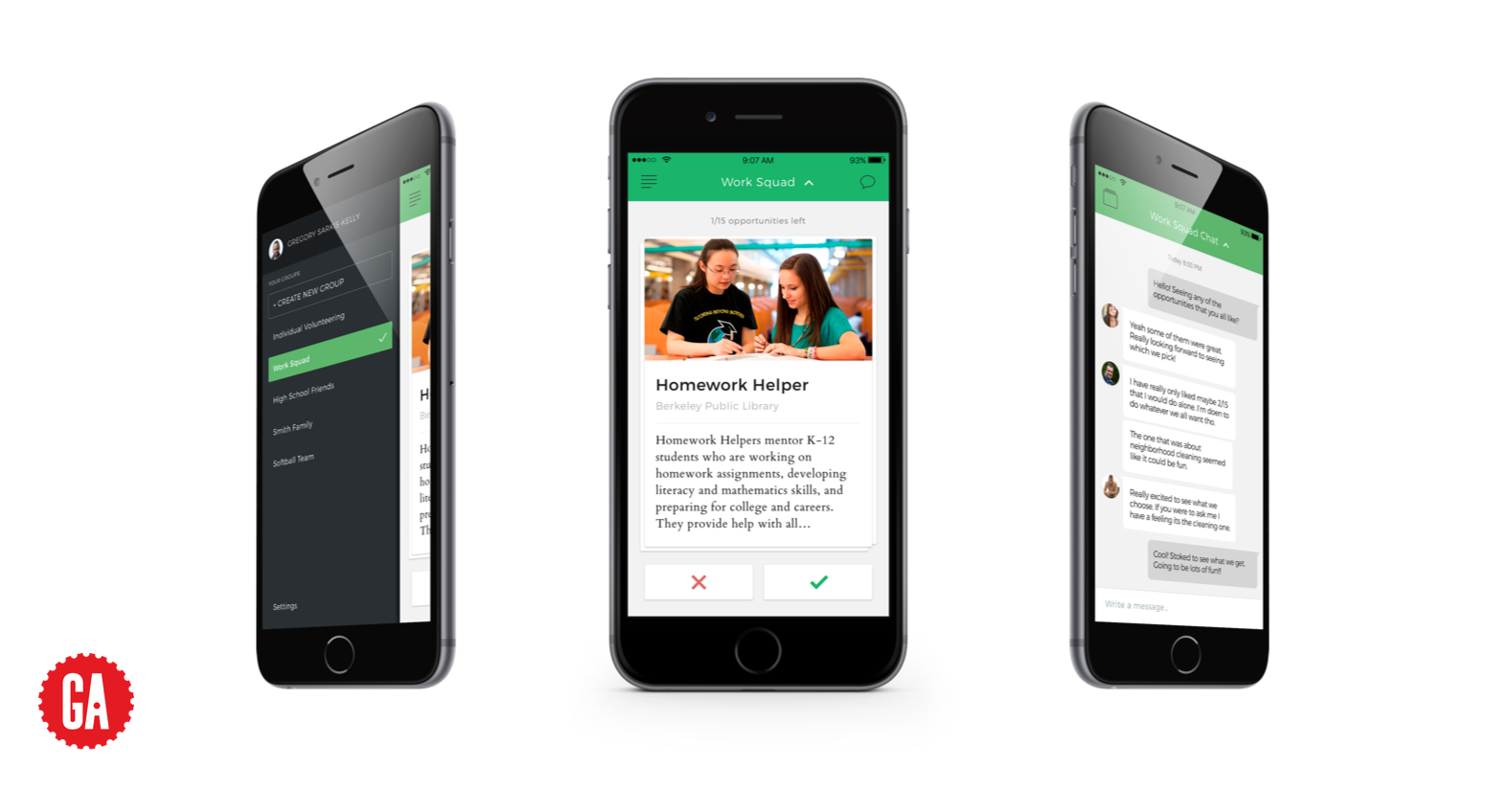
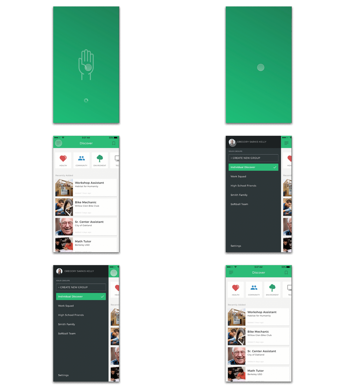
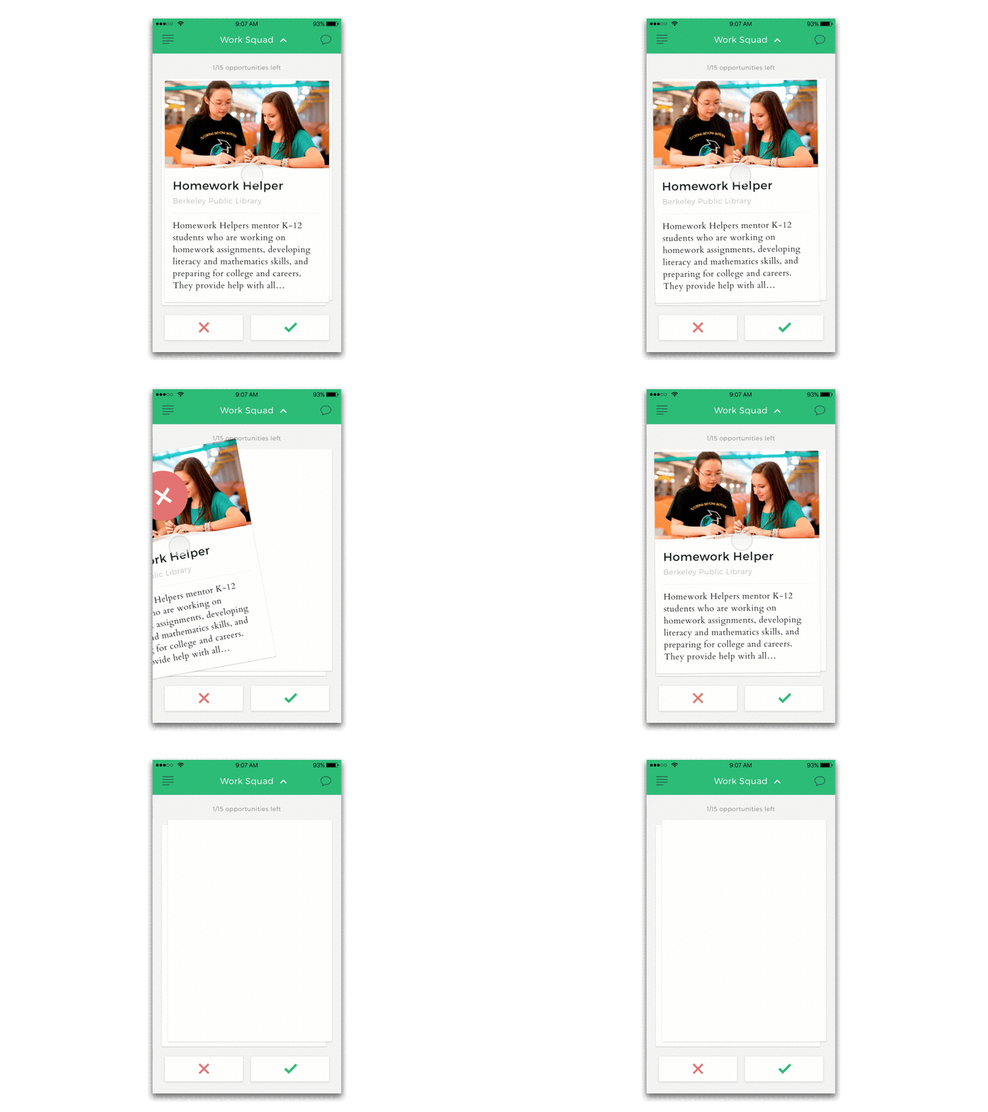
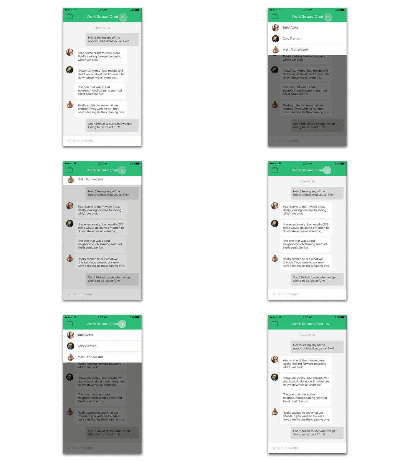
To begin the process of visual design, I collected screenshot of competitor apps to understand what visual trends already exist in this space. After researching all competitors from my Competitive analysis it seemed that light Greens and Blues were popular for community applications such as this. With this I chose a green as my main color with supporting colors of Green-Blue, Black, White, and Grays. As I wanted to keep the focus on the content and off the header’s iconography, I chose black line icons in the top bar to be visible while not being the focus of the screen or distracting the eye. I decided on typefaces of a Sans-Serif (Montserrat) for bold headings and subheadings, while using a Serif (Cardo) font for body type which is easier to read and softer on the eye. Finally in order to give volunteers a the best visual understanding of each volunteer opportunity, I made sure to use full bleed images during card sorting, detail views, and training modules. All of these elements were chosen with the user in mind, to create an atmosphere where they can feel comfort and trust.


